

Template of a responsive page for all screens, based on flex
Flex is an new CSS property to let pages automatically adapt to different screens.
This is a value of the display attribute. CSS has simply added an extra value to an existing property:
- display:none : Hidden element.
- display:inherit: Same format as the container.
- display:inline : Displayed after the previous one without a line break.
- display:block : The element is placed on a new line with size and margin attributes.
- display:inline-block : A block that can be juxtaposed to the previous one if it is narrower than the container.
- diplay:list-item : As a line in a list with a bullet.
- display:flex : Flexible display of the contents of the container.
Once the flex value has been chosen, other properties can be added to the container.
- flex-direction:column | row
Presents the contained elements in a column or on a line (by default). - flex-wrap: wrap | nowrap (defaut).
- Wrap makes that one goes to a new line when the elements overflow.
- Nowrap places all items on a line, reducing their width as needed.
- justify-content:center | flex-start (défaut) | flex-end | space-around | space-between
- center presents the elements side by side in the center of the row.
- flex-start justifies them on the left.
- flex-end justifies them right.
- space-around places them at regular intervals by spacing them on the row.
- space-between aligns the content on the left and right or top and bottom depending the direction, by putting space between the elements.
For inner items, various properties are also added. Including flex-shrink which indicates whether the element can be reduced or not to free up space. flex-shrink: 0 indicates that it should not be reduced.
We want to use these new properties to create the model of a web page, which is responsive and using a minimum of CSS code.
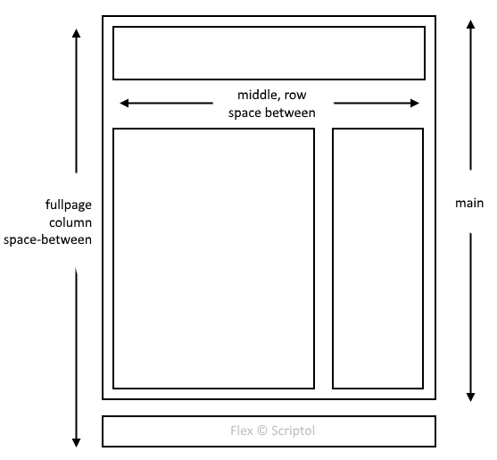
To do this, we must subdivide the page into several sections:
- Fullpage is the main container, its two elements are aligned in columns.
- The first element, main, and the second, footer are separated by a variable space, depending on the content of the page.
- Footer, is always at the bottom of the window, even if the page is almost empty.
- Main contains two items arranged in column, header, and middle.
- Header has a fixed height, middle a variable height.
- Middle contains two elements arranged in a row (default value, therefore not specified). They are separated by a variable space depending on the content.
- The first element, content, has a variable width and is placed on the left.
- The second, sidebar, on the right, has a fixed width.
This gives a layout corresponding to the following diagram:
The CSS code is very simplified:
<style>
html, body: {
  margin:0;
  padding:0;
}

#fullpage {
  display:flex;
  flex-direction:column;
  justify-content:space-between;
  margin:0;
  position:absolute;
  top:0;
  bottom:0;
  left:0;
  right:0;
}

#middle {
  display:flex;
  justify-content:space-between;
}

#header {
  height:100px;
}

#content {
  padding:32px;
}

#sidebar {
  width:200px;
}

#footer {
  min-height:64px;
  display:flex;
  flex-direction:column;
  justify-content:center;
}
</style>
I have removed from the code of the demonstration all that is not used to the disposition of the elements. The complete code is in the demo page.
If you want to limit the maximum width of the page, you can add these two lines in the #fullpage property:
max-width:1280px;
margin:auto;You can download it and use it as a starting point for a site or an application.
The flex value of display is supported by all recent browsers. If you want to maximize the views, you need to stay at the classic CSS, so here is a responsive page template for any legacy browser.