

How not to make a web application interface
The creation of a web or local application should involve at least two actors: the developer and a designer.
Interface design was revolutionized several times, mainly by Apple. An initial progress has been achieved by the unification (at the time of the Apple II), all programs having to use the same commands for the same functions, which was not previously the case, we had to relearn the keyboard with each software, and programmers in particular where not able to move from one editor to another without relearning the controls..
Then ideas in Palo Alto were taken, and appeared the GUI with the mouse. But then the firm has consistently innovated in this area and since the iPod has never sold a device without its user's use is fully developed to provide the most intuitive behavior to the user. To do this, the task of designing interfaces was removed from programmers.
The programmer is always the best person to write the application, and sometimes, he is also able to build a perfect interface, but this part is in fact a different sort of work. This is shown by some unfortunate experiences such as Gnome Shell 3 for example!
How not to make an interface
- Define the functions of the software first and create a command for each thereafter.
- Add function after function over time, and add a button for each.
- Define the perfect interface for ... a programmer. Users are not always technicians and are not familiar with the intricacies of how a program works.
- In summary, do not let programmers make the user interface... it is a different job. But a programmer could occasionally had a gift of designer. Sometimes ;)
You can find good examples of bad ideas in Windows, at least until version 7 (I have not tried the next version). Very often, when I click on a file name, the system proposes to rename it. Does renaming files is so prevalent that we have to make this a so direct operation? I do not believe. This is an idea that seemed interesting to programmers and they have chosen to implement it without taking into account the point of view of the user.
Another anomaly, always about renaming is the ability to rename a group of files in block. I've heard that some programmers liked to be able to rename files of a project all together, but otherwise what is the point of giving the same name to multiple files? This happened sometimes to me, but inadvertently because I have not seen that files were selected in the list out of the visible window... And then I had to find what represents each file!
In Windows, examples of bad design choices are endless. When you move a window on the side of the screen for example, to see the others, it get displayed in full screen and it's more than annoying. To give the user a better experience, one should follow some rules ...

Another example ... The screen above is that of the operator in Honolulu who inadvertently issued a ballistic missile alert in the country, when he just wanted to do a test. Specifically, he wanted to click on "DRILL - PACOM (CDW) - STATE ONLY" and clicked on "PACOM (CDW) - STATE ONLY".
No confirmation request, no possibility to roll back! Moreover, it would have been wise to separate the test orders from the actual orders ...
How to make an interface
- Must divest itself completely of its experience and be able to put itself to the place of user who is totally a beginner.
Try to imagine being transported in a foreign country where you know neither the language nor the customs, with the duty to cope with the signs to find the services you need. - Define the interface independently of the software. Then try to associate the code with user's actions.
- Use a predefined framework for its widgets, and make the best use of it, with imagination.
- Create a model prior to the construction of the interface, imagine it in action, all user actions and search for simplifications.
- Remove all unnecessary steps in performing a task. For example, aggregate functions on a single page if possible.
- Read again the principles of web design.
Here is an example of a form created by programmers and reimagined by a designer ...
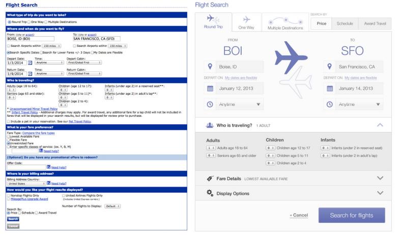
A little nicer, is it not? (Reference: Nathan Barry).
See also
External links
- Realism in UI design. A tutorial on interface design: which level of realism?